Restaurant website design: bad, but oh so beautiful
I hate to bring up another example of bad restaurant website design (no, really, I do), but I couldn't let this go unnoted.
On Friday night, we're eating at Adour, the newest restaurant in Alain Ducasse's empire.
This guy is at the top of the league. Has multiple Michelin stars. Knows his stuff.
And yet the site for Adour ... well ... c'est pas bon.
Oh, it's gorgeous, for sure. Check out the eight time-lapse movies: iconic images, all movement and light, they're New York in a nutshell.
And now (after turning off the intrusive lounge-jazz soundtrack), I want to find a menu.
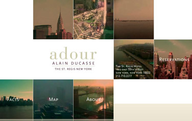
Hmm ... my choices are "Reservations," "Map," "Facts" and "About"; I can probably dismiss the first two, but what's the difference between the last two?
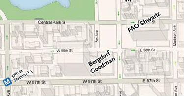
Oh, and there's a typo on the map.
Am I being picky? Should I learn to back off? Frankly, no. While I don't pay too much mind to prices (especially for special occasions), it's worth noting that Adour's least expensive app is $19. The cheapest main (olive oil-poached cod) is $32.
Adour is intended for diners who expect impeccable service, excellent ingredients, flawless presentation. And yet the message I get from the site is: lovely to look at, but don't expect us to be too concerned about the details.
I guess I'll just have to hope that the kitchen staff pay more attention to their work than the site designers did ...
On Friday night, we're eating at Adour, the newest restaurant in Alain Ducasse's empire.
This guy is at the top of the league. Has multiple Michelin stars. Knows his stuff.
And yet the site for Adour ... well ... c'est pas bon.
Oh, it's gorgeous, for sure. Check out the eight time-lapse movies: iconic images, all movement and light, they're New York in a nutshell.
And now (after turning off the intrusive lounge-jazz soundtrack), I want to find a menu.
Hmm ... my choices are "Reservations," "Map," "Facts" and "About"; I can probably dismiss the first two, but what's the difference between the last two?
Oh, and there's a typo on the map.
Am I being picky? Should I learn to back off? Frankly, no. While I don't pay too much mind to prices (especially for special occasions), it's worth noting that Adour's least expensive app is $19. The cheapest main (olive oil-poached cod) is $32.
Adour is intended for diners who expect impeccable service, excellent ingredients, flawless presentation. And yet the message I get from the site is: lovely to look at, but don't expect us to be too concerned about the details.
I guess I'll just have to hope that the kitchen staff pay more attention to their work than the site designers did ...
Labels: adour, ducasse, New York restaurants, website design
posted by LimeyG at
4:41 PM
0 Comments
![]()
![]()