Restaurant website design: it's easy to be bad
Rest easy, my peoples: we have found our restaurant for Saturday evening in NYC. We'll be making a return trip to Wallsé, the rather lovely one-Michelin-starred Austrian place in the West Village. Thanks for your suggestions; they may come in handy for lunch!
It took a while for us to make a decision; OpenTable had 500+ restaurants in Manhattan alone with availability for next Saturday night, and even after dismissing a few categories whole-cloth (no steakhouse, no seafood, not French for a change), that still left a couple of hundred options.
So we started exploring. And we quickly realized there are a lot of bad restaurant websites out there.
One great (or terrible) example is the all-Flash Morimoto New York. First you have to click to launch the site. Then there's the ten-second delay while it loads. Then--like it or not--you get mood-setting music (hunt for the five-pixel-wide speaker icon to turn it off).
It looks like this (I added a hint so you can find the nav):
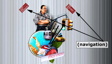
Click an option, and giant crab claws and Ginsu knives bum-rush the screen. The type size remains defiantly small.
While crafting this slick choreography of image and music, did anyone check, you know, the text?

At The Water Club, we find not so much a poorly designed restaurant website as a subtly strange choice of functionality. Say you're looking for a menu. Where are you most likely to click?
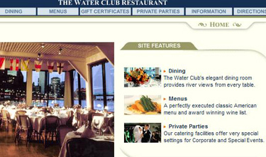
The item in the "Site Features" section won't help--nothing there is clickable, even though it's in the most eye-catching part of the page. For some reason, only the top nav is active. Stuff like this makes me wonder: if they don't know how to communicate with customers online, what will service be like tableside?
Oh, also, the FAQ section is "under construction." Is this because no one ever asks any questions?
But the prize for bad restaurant website design goes to AZZA Restaurant and Lounge, and not only because the reviews in the press-clippings section skip away before you can finish reading them. No, this site goes above and beyond.
But don't take my word for it. Go check it out, and take a look at the menu for yourself.
I'll wait here.
It took a while for us to make a decision; OpenTable had 500+ restaurants in Manhattan alone with availability for next Saturday night, and even after dismissing a few categories whole-cloth (no steakhouse, no seafood, not French for a change), that still left a couple of hundred options.
So we started exploring. And we quickly realized there are a lot of bad restaurant websites out there.
One great (or terrible) example is the all-Flash Morimoto New York. First you have to click to launch the site. Then there's the ten-second delay while it loads. Then--like it or not--you get mood-setting music (hunt for the five-pixel-wide speaker icon to turn it off).
It looks like this (I added a hint so you can find the nav):

Click an option, and giant crab claws and Ginsu knives bum-rush the screen. The type size remains defiantly small.
While crafting this slick choreography of image and music, did anyone check, you know, the text?

At The Water Club, we find not so much a poorly designed restaurant website as a subtly strange choice of functionality. Say you're looking for a menu. Where are you most likely to click?

The item in the "Site Features" section won't help--nothing there is clickable, even though it's in the most eye-catching part of the page. For some reason, only the top nav is active. Stuff like this makes me wonder: if they don't know how to communicate with customers online, what will service be like tableside?
Oh, also, the FAQ section is "under construction." Is this because no one ever asks any questions?
But the prize for bad restaurant website design goes to AZZA Restaurant and Lounge, and not only because the reviews in the press-clippings section skip away before you can finish reading them. No, this site goes above and beyond.
But don't take my word for it. Go check it out, and take a look at the menu for yourself.
I'll wait here.
Labels: food, New York restaurants, OpenTable, restaurants, wallse, website design


0 Comments:
Post a Comment
Subscribe to Post Comments [Atom]
<< Home